But we all came to know about this because of the great advertiser Doyle Danne Bernbach. He was so talented that Volkswagen advertisement was named one of the best advertisements in the 20th century.
His genius approach deviated from tradition in many ways.
If you saw the ads at the time, you’d notice that they were designed to be eye-catching, large, and fashionable.
Vehicles were all about showing off. On the other hand, Doyle, on the other hand, took this chance of “contradicting the usual association of car luxury” with simplicity.
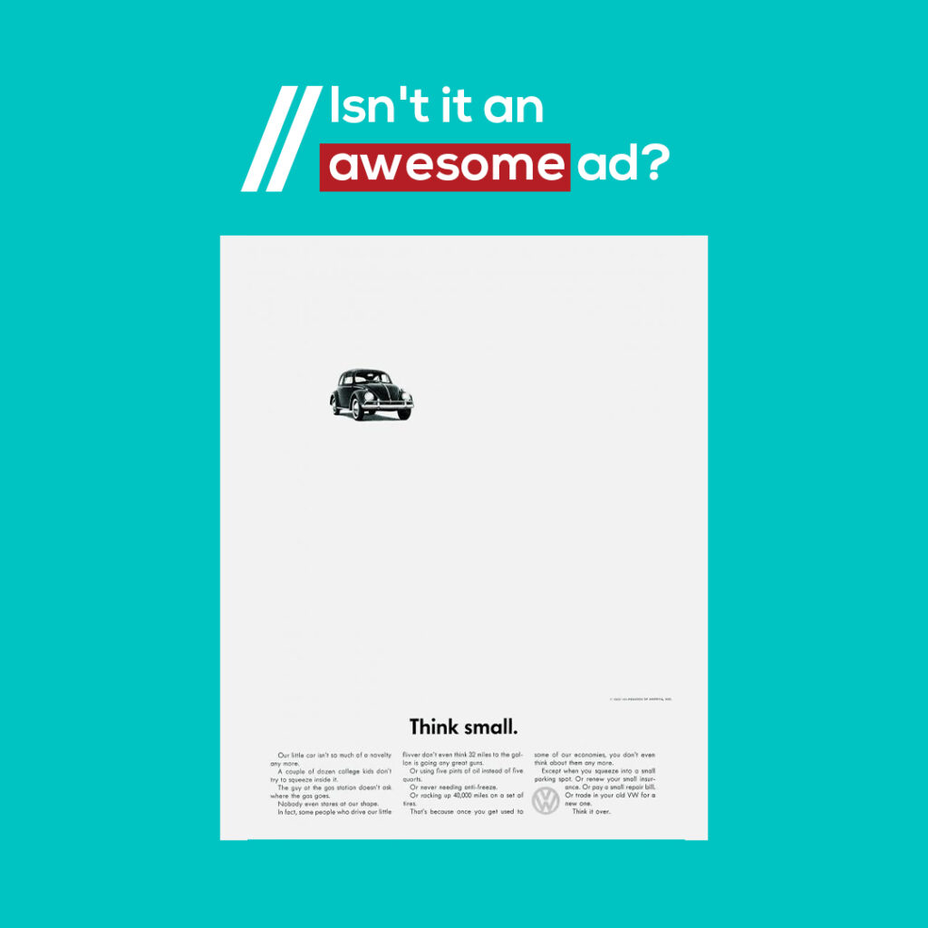
While the image, headline, and three-column text were kept in the layout’s usual structure, other slight but significant alterations made this a success. Here it was written, “Think small.” That’s refreshing after hearing that bigger is better for everything.
This advertisement featured a small beetle to highlight its simplicity, the benefits of having a small car in the text, and a small type that appeared at the bottom of the page.
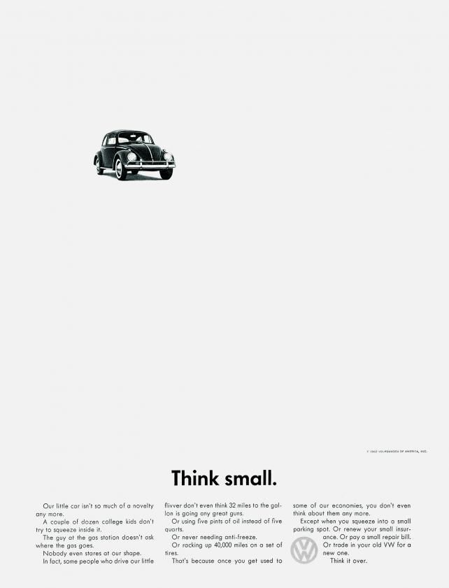
The car’s image was in the upper left corner and tilted to draw our eyes to the title. This commercial was finally printed in black and white during a time when colour advertisements were common. Simplicity is a common theme here.
How bold are the decisions he took for one advertisement? Would you have done this if you were Doyle?
This is a typical straw man scenario. They presented you with an ideal car and explained why the VW wasn’t anything like it, and then they demolished the straw man by praising the VW. Since the VW isn’t fast, it doesn’t suck fuel, wear out its tires, or require frequent maintenance. Wait, that actually sounds pretty wonderful. If you and I back then saw this advertisement, we would all be like “oh, after all, having a small car is actually practical”.
If you were in the audience, wouldn’t your contemporary thinking pattern be challenged? I know it would have challenged my way of thinking.
Also, see how the advertisements discuss the automobile. Instead of being referred to as a Volkswagen, it is frequently called a “VW.” VW is hip, modern, uncomplicated, and welcoming. You had no idea that they had implanted this idea into your mind! The graphics needed to be excellent in order to emphasize and support this message.
However, nothing can be perfect, right? One might call this type of advertisement not sustainable for the long term. Which is quite true. But for the 20th century, this was the perfect twist.
This was on a white background. It is a black dot. This was an understatement that was simultaneously strong and frightening when coupled with the headline “Think Small.” With an empty background, your eyes are compelled to focus on the car.
The coolest part here is that Volkswagen followed this idea without throwing it to the dust, as what happens to the greatest ideas.